
In an era where smartphones have become an extension of ourselves,the way we experience the web has shifted dramatically. Websites that once thrived on desktop screens now face a new challenge: capturing the attention of mobile users on smaller, faster-paced devices. Optimizing your website for mobile users is no longer a choice—it’s a vital step in ensuring your digital presence remains accessible, engaging, and effective. This article will guide you through practical strategies and insightful tips to transform your site into a seamless mobile experience, helping you connect with users anytime, anywhere.
Understanding Mobile User behavior and Expectations
Mobile users interact with websites in a fundamentally different way compared to desktop users.Speed and ease of navigation are paramount; users expect instant access to information without excessive scrolling or tapping. They often browse in bursts, on the go, with shorter attention spans. This means that content should be concise, visually clear, and prioritized to address their immediate needs. Additionally, touch-friendly interfaces and simple, intuitive layouts encourage longer visits and reduce bounce rates.
Understanding these behaviors helps designers and developers anticipate user expectations, such as:
- Fast-loading pages: Slow websites lose users quickly – 53% of mobile visitors abandon a site that takes over 3 seconds to load (source).
- Clear calls to action: Mobile users want to know exactly where to click or tap to get what they need.
- Readable content without zoom: Fonts and buttons must be appropriately sized.
| Behavior | Expectation | Optimization Tip |
|---|---|---|
| Short sessions | Quick answers | Highlight key info |
| Touch navigation | Easy interactions | large tap targets |
| Varied environments | Flexible layouts | Responsive design |
By aligning your site’s design and functionality with actual mobile user behaviors, you create an experience that feels natural and satisfying. This not only increases engagement but also builds trust,driving repeat visits and conversions.
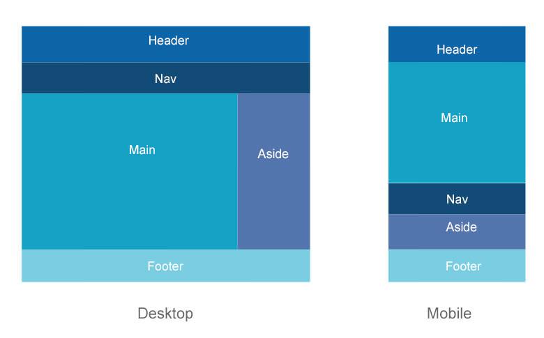
Designing Responsive Layouts for Seamless Mobile Navigation
Creating fluid and adaptable layouts is crucial for delivering an extraordinary mobile experience. Utilizing flexible grid systems ensures that content and navigation elements adjust seamlessly across diverse screen sizes, maintaining usability without sacrificing design integrity. Employ techniques such as media queries to tailor styles specifically for various devices, prioritizing touch-friendly buttons and readable typography.
Incorporate navigation patterns that are intuitive on smaller screens, such as hamburger menus, bottom navigation bars, and collapsible accordions. These elements reduce clutter while providing quick access to essential site areas. Consider the following guidelines to enhance mobile navigation efficiency:
- Optimize tap targets to at least 48×48 pixels for cozy interaction.
- Limit the primary navigation items to 5–7 to avoid overwhelming users.
- Use clear visual feedback, like hover and active states, for links and buttons.
- Implement sticky headers to keep navigation accessible as users scroll.
| Technique | Benefit | Example |
|---|---|---|
| Media Queries | Device-specific styling | MDN Docs |
| Flexible Grids | Adaptive content layout | CSS-Tricks Guide |
| Touch Target Optimization | Improved accessibility | W3C Guidelines |

Enhancing Page Speed to Reduce Mobile Bounce Rates
Mobile users expect lightning-fast load times, and even a delay of a few seconds can lead to a significant increase in bounce rates. To keep visitors engaged, it’s vital to streamline your site’s performance by prioritizing speed optimization techniques tailored for mobile devices. Begin by minimizing HTTP requests—combine CSS and JavaScript files and use image sprites where applicable. Leveraging browser caching and enabling compression with tools like Gzip can further decrease load times, ensuring your content loads efficiently on slower networks.
Another essential strategy is to prioritize responsive design coupled with lazy loading. Images and videos should only load when they come into the viewport to save bandwidth and processing power.Using tools such as Google’s PageSpeed Insights helps you identify specific bottlenecks affecting your site’s mobile performance, allowing targeted fixes that improve speed and reduce bounce rates effectively.
| Optimization Technique | Impact on Speed | Recommended Tools |
|---|---|---|
| Minify CSS & JS | Reduces file size by up to 30% | Minify Resources |
| Enable Compression | Speeds up transfer time by 50% | mod_deflate (Apache) |
| Lazy Load Images | Improves initial page load | Intersection Observer API |
- Use CDN services to reduce latency by serving content closer to users.
- Optimize images using modern formats like WebP for faster rendering.
- Reduce redirects wich add unneeded HTTP requests.

Implementing Touch-Friendly Elements for Better User Interaction
When designing for touchscreens, accommodating finger-friendly interactions is essential. Small, crowded buttons can lead to frustration, so aim to create elements that are easily tappable without the risk of accidental taps. The recommended minimum touch target size is 48×48 pixels, ensuring users can confidently navigate without needing to zoom or struggle.Additionally, spacing between interactive components should be generous enough to prevent overlap or errors in selection.
Besides sizing, consider the Apple Human Interface Guidelines and Google Material Design standards, which offer in-depth insights into touch-friendly design practices, including gestures and feedback. Feedback mechanisms such as subtle animations or color changes upon tap enhance the feel of responsiveness and can make the interface more intuitive.
- Increase button size and padding to ensure easy contact
- Maintain clear spacing between interactive elements
- Incorporate visual feedback to confirm interactions
- Utilize common gestures like swipe and pinch for enhanced navigation
| Element | Recommended Size | best Practice |
|---|---|---|
| Button | 48×48 px | Ample padding, clear labels |
| Link | Minimum 44 px height | Underlined or visually distinct |
| Form Input | At least 40 px height | Large touch targets with spacing |
Optimizing touch-friendly elements not only improves accessibility but also greatly enhances the overall user experience on mobile devices. For further reading on creating accessible mobile interfaces, visit the W3C Mobile Accessibility Guidelines.
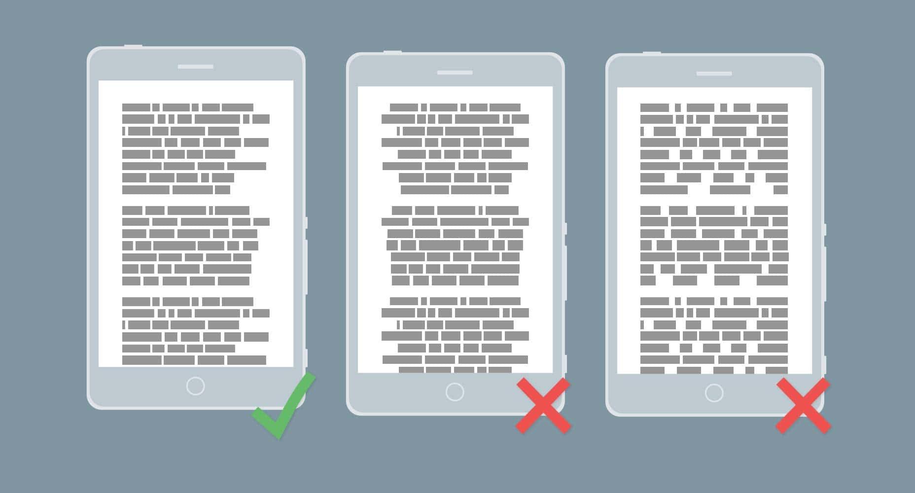
Optimizing content for Readability on Small Screens
Ensuring your content is easily digestible on compact screens requires a strategic approach to typography and spacing. Use a font size of at least 16px to enhance readability,as smaller text can strain the eyes on mobile devices. Line height should be adjusted to around 1.5 to create enough whitespace, preventing the text from feeling cramped. Additionally,limit paragraph length to 2-3 sentences to keep readers engaged and facilitate quick scanning.
Visual hierarchy plays a crucial role in guiding users through your content. Utilize clear headings, bullet points, and concise paragraphs to organize information effectively. Lists are especially useful on small screens; they break down complex ideas into bite-sized points that are easier to process.such as:
- Short sentences that get to the point
- Adequate spacing between lines and paragraphs
- Bold keywords to emphasize important concepts
- Responsive images with proper scaling
| Readability factor | Recommended Adjustment |
|---|---|
| Font Size | >= 16px |
| line Height | 1.5 times font size |
| Paragraph Length | 2–3 sentences |
For more guidance, MDN Web Docs provides comprehensive insights on mobile accessibility standards that can significantly improve your site’s usability for mobile users.
Insights and Conclusions
As the digital landscape continues to shift toward on-the-go browsing, optimizing your website for mobile users isn’t just a bonus—it’s a necessity. By embracing responsive design, streamlining content, and prioritizing speed, you pave the way for a seamless mobile experience that keeps visitors engaged and coming back for more. Remember, in the realm of mobile web, adaptability is your greatest ally.So, take these insights as your toolkit, and transform your site into a mobile-friendly destination that meets users where they are—anytime, anywhere.